A dorm room starts to look more expensive when the colors feel intentional. The furniture may be basic, the walls may be plain, and the room may be small, but the right color palette can make everything feel calmer, softer, and more pulled together.
The easiest way to make a dorm room look professionally styled is to choose two or three main colors before buying anything. Bedding, pillows, curtains, art, storage, lighting, and a rug do not need to match perfectly, but they should feel like they belong in the same room.
Dorm Styler builds complete room palettes so students and parents do not have to guess which pieces work together. These five dorm room color palettes are designed to feel elevated without making the room look overly decorated, cluttered, or impractical for real college life.
Quick Answer
The best dorm room color palettes start with a calm base color, one soft accent color, and one grounding texture. Choose Cozy Neutrals for warmth, Sage Garden for fresh softness, Bluebell Cottage for classic airiness, Blush Bow for feminine polish, or Heritage Navy for timeless structure. Cream and beige feel warm and neutral. Sage green feels fresh and relaxed. Blue and white feels classic. Blush pink feels feminine without feeling too young. Navy feels polished, timeless, and tailored.
Key Takeaways
• Start with bedding — it is the largest visual surface and sets the tone for everything else.
• Limit the palette to two or three main colors plus one grounding texture.
• Repeat the accent color in at least three places to make the room feel intentional.
• Choose storage and practical items in colors that blend into the palette.
• Texture matters as much as color — woven baskets, soft rugs, and layered pillows add depth.
Why color palettes matter in a dorm room
Dorm rooms are visually busy by default. There are beds, desks, storage bins, laundry baskets, chargers, school supplies, bedding, shoes, clothes, and practical items all competing for attention. Without a clear color palette, even nice products can start to look messy once they are placed together.
A good palette gives the room structure. It helps the bed feel styled instead of thrown together. It makes storage look less chaotic. Most importantly, it helps parents shop with more confidence because every item has a clear reason to be there.
The goal is not to make the dorm room look perfect. The goal is to make it feel calm, comfortable, and finished enough that the student actually enjoys spending time in it.
A strong dorm room color palette should do three things:
- Make the bed the visual anchor of the room.
- Help practical items blend in instead of standing out.
- Create a clear style direction before move-in shopping gets overwhelming.
How to choose a dorm room color palette
Start with the bedding. In most dorm rooms, the bed is the largest visual surface, so the bedding sets the tone for everything else. After that, choose pillows, a throw, a rug, curtains, art, and desk accessories that support the same feeling.
A simple formula is:
- One base color, such as white, cream, beige, or soft blue.
- One accent color, such as sage, blush, navy, or powder blue.
- One grounding texture, such as woven baskets, wood tones, rattan, stripes, or a simple patterned rug.
Avoid choosing too many unrelated colors at once. A dorm room can have plenty of personality without using every color in the store. A tighter palette almost always looks more expensive.
Dorm Styler Tip
Repeat one accent color in three places — the throw pillow, the desk accessories, and the artwork — to make a small dorm room feel intentional instead of cluttered. This simple trick costs nothing extra and makes the biggest visual difference.
1. Cozy Neutrals: soft, calm, and easy to style
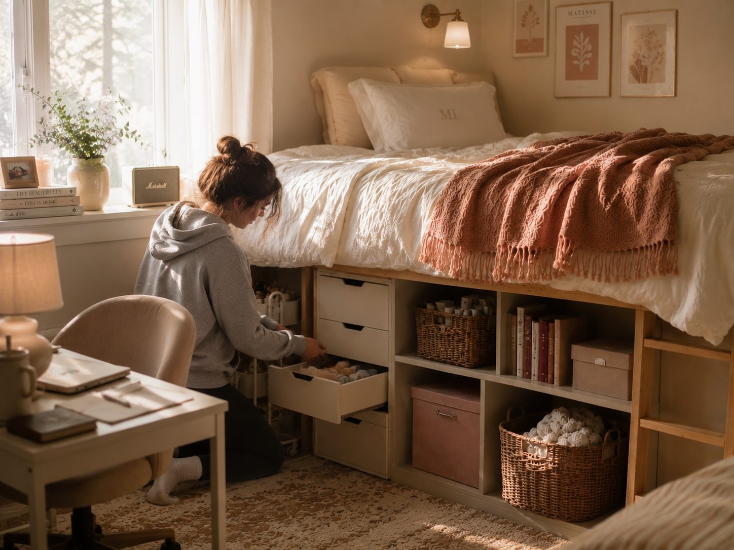
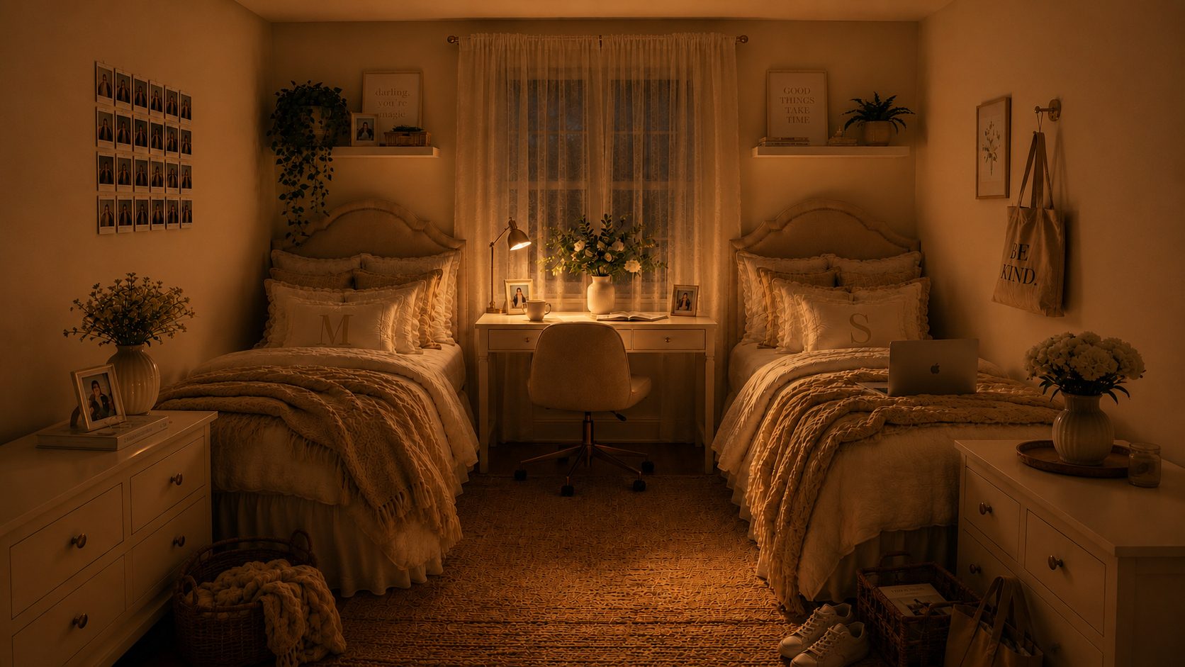
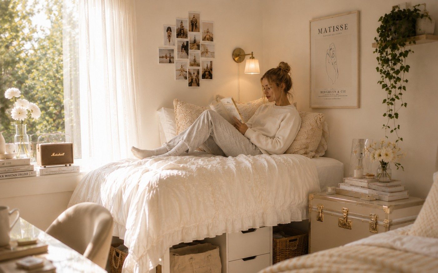
Cozy Neutrals is the safest palette for parents and students who want the room to feel pretty, calm, and easy to live with. It works especially well in dorm rooms because neutral colors make a small space feel softer and less visually crowded.
This palette is built around cream, beige, ivory, warm white, and natural woven textures. It looks expensive because it relies on texture instead of bright color. A neutral room can still feel beautifully layered when the bedding, pillows, throw, rug, and baskets have slightly different materials.
Cozy Neutrals is a strong choice if the student wants a room that feels peaceful, clean, and grown-up. It is also easy to update later because almost any small accent color can be added without replacing the whole room.
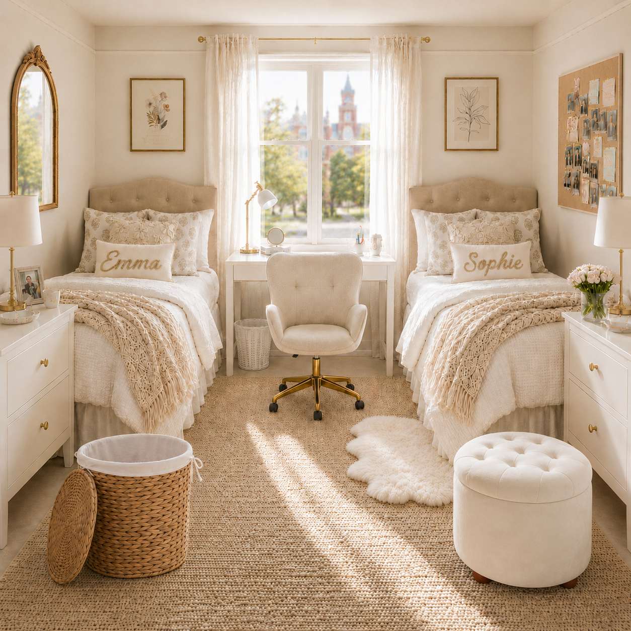
What makes it work:
- Cream bedding keeps the room light and airy.
- Beige and tan accents add warmth.
- Woven baskets and soft rugs stop the room from feeling flat.
- Simple pillows make the bed look styled without feeling busy.
Best styling rule: Layer textures rather than adding new colors. A chunky knit throw on a smooth comforter creates visual interest without changing the palette.
Common mistake: Using only flat, smooth materials. A neutral room needs texture variation — woven, knit, linen, and soft fabrics — to avoid looking sterile.
Best neutral base: Cream or warm white.
Best metal finish: Brass or natural wood.
Best for: Students who want a calm, minimal, warm, and polished dorm room that still feels soft and comfortable.
2. Sage Garden: fresh, soft, and relaxed
Sage Garden is a softer way to introduce color into a dorm room. It feels fresh without being overly bright, and it gives the room personality without making the space feel loud.
Sage works beautifully with cream, white, beige, and natural textures. It can feel feminine, but not overly pink. It can feel earthy, but not rustic. It gives the room a relaxed, garden-inspired feeling while still looking tidy and considered.
This palette is especially good for students who like a calm, pretty room but want more personality than an all-neutral design can offer.
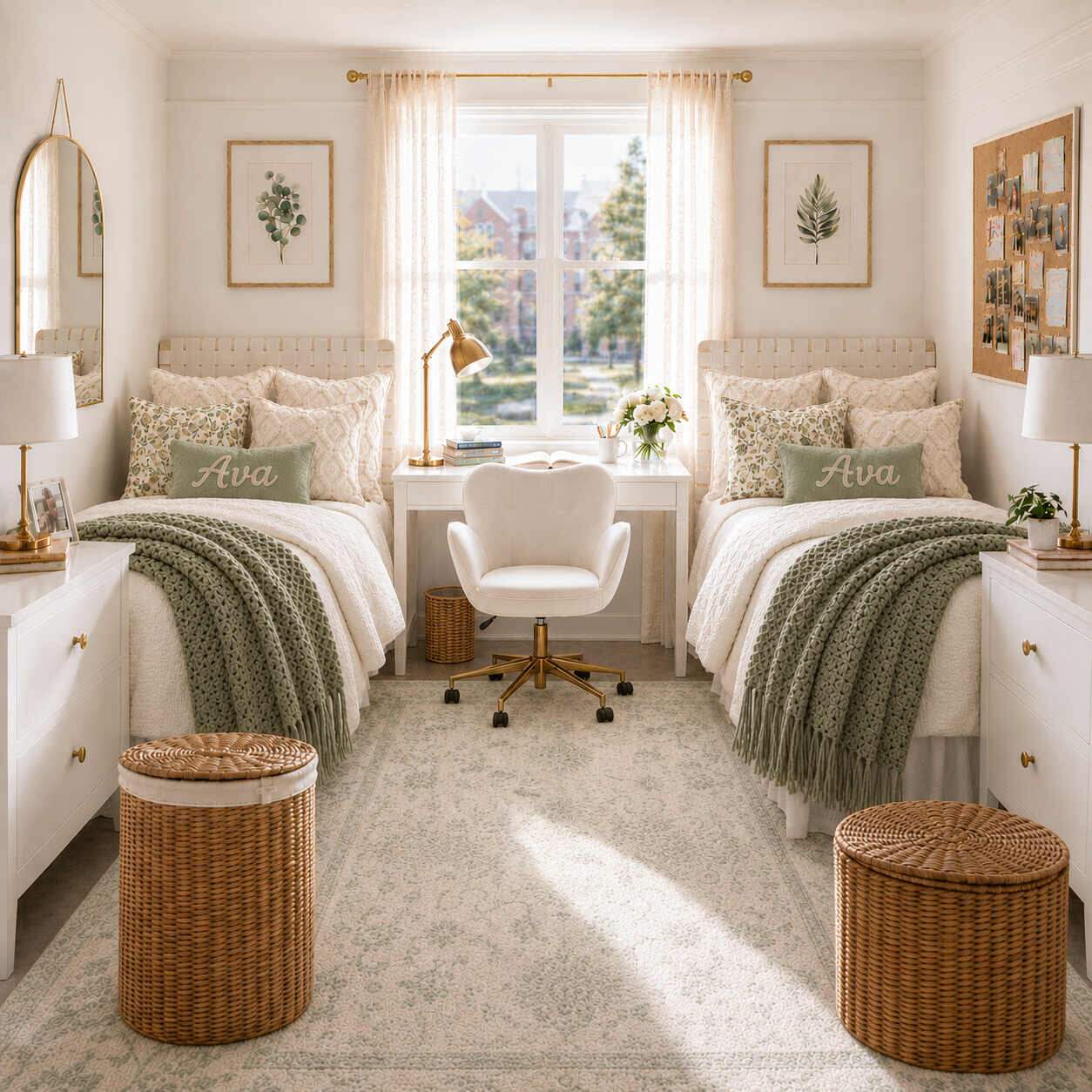
What makes it work:
- Sage green adds color while still feeling soft and muted.
- Cream bedding keeps the overall palette light.
- Botanical art or floral details make the room feel intentionally styled.
- Natural baskets and warm textures keep the green from feeling cold.
Best styling rule: Keep sage as an accent on the bedding or pillows, not the walls. Dorm walls are usually white or beige, so let the green appear in textiles and accessories.
Common mistake: Pairing sage with bright white instead of cream. Bright white can make sage look dull. Warm cream or ivory brings out the best in this green.
Best neutral base: Cream or warm white.
Best metal finish: Brass or matte black.
Best for: Students who want a fresh, feminine, nature-inspired dorm room that feels peaceful and easy to live in.
3. Bluebell Cottage: classic, airy, and pretty
Bluebell Cottage is a blue and white dorm palette that feels classic without becoming too formal. It has a softer, cottage-inspired feeling, which helps a basic dorm room feel much more considered.
Blue and white is one of the easiest palettes to make look expensive because it feels crisp and timeless. In a dorm room, the key is to keep the blue soft enough that the room still feels relaxing. Powder blue, denim blue, pale blue, and crisp white all work beautifully together.
This palette is especially strong when the room needs to feel fresh, clean, and cheerful without becoming too colorful.
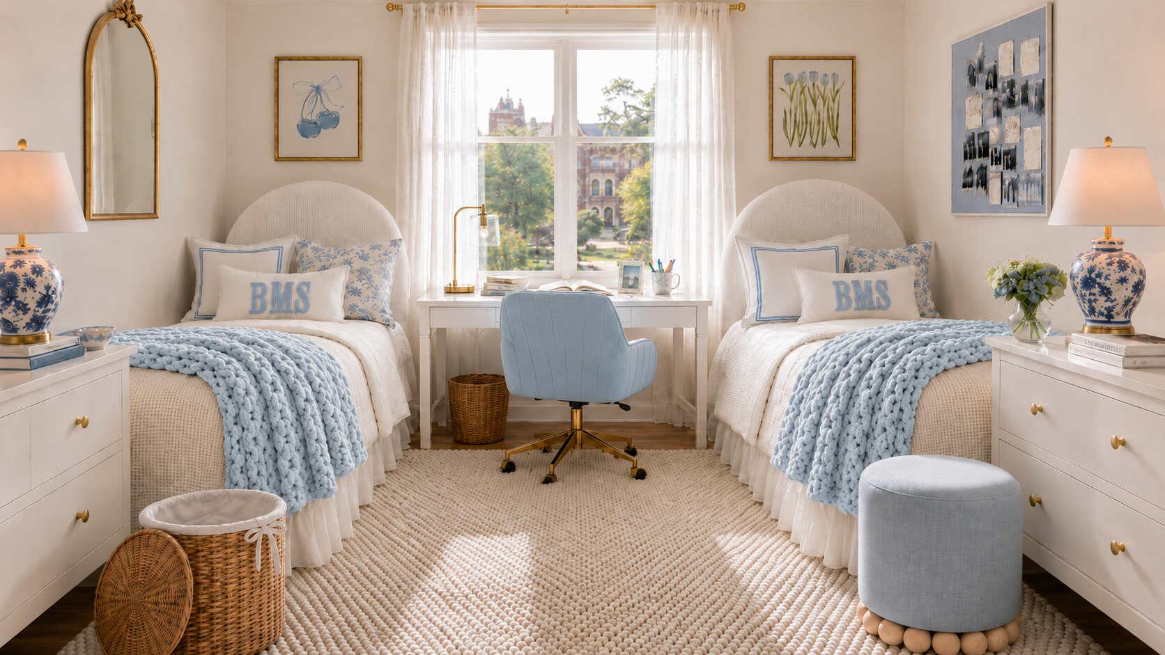
What makes it work:
- Blue and white always feel clean and classic.
- Soft blue adds color without overwhelming the small space.
- Patterned pillows or art add charm.
- White bedding and light accents keep the room from feeling heavy.
Best styling rule: Use blue in doses — a patterned pillow, a small rug, or desk accessories. Too much solid blue can feel cold in a small room.
Common mistake: Using dark navy instead of soft powder blue. Dark blue works in the Heritage Navy palette, but Bluebell Cottage needs lighter, airier tones.
Best neutral base: Crisp white or cream.
Best metal finish: Silver, chrome, or white ceramic.
Best for: Students who like a classic, pretty, light-filled dorm room with a slightly coastal or cottage-inspired feeling.
4. The Blush Bow: feminine, soft, and polished
Blush Bow is designed for the student who wants a feminine dorm room, but still wants it to feel elevated. The trick with pink is restraint. Too much bright pink can make a small room feel young or chaotic, but soft blush tones paired with cream and white can look beautiful.
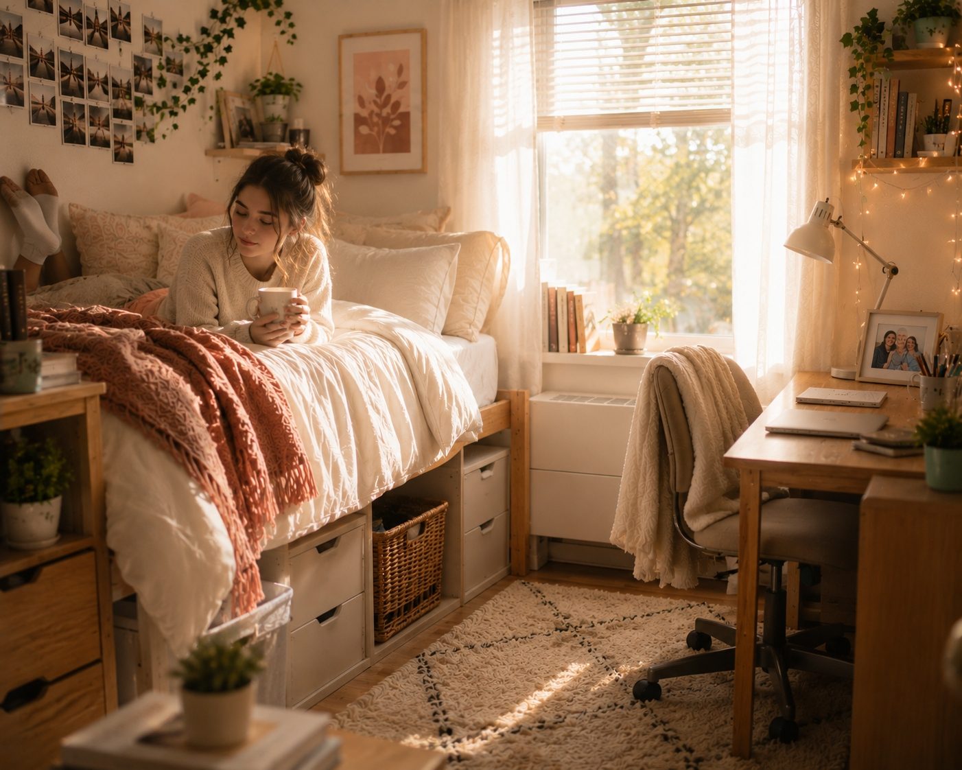
This palette works because pink is treated as an accent rather than the entire room. Cream bedding, soft pillows, delicate art, and pretty details make the space feel romantic without becoming overwhelming.
Blush Bow is especially good for students who love feminine details, bows, soft textures, and a room that feels pretty as soon as they walk in the door.
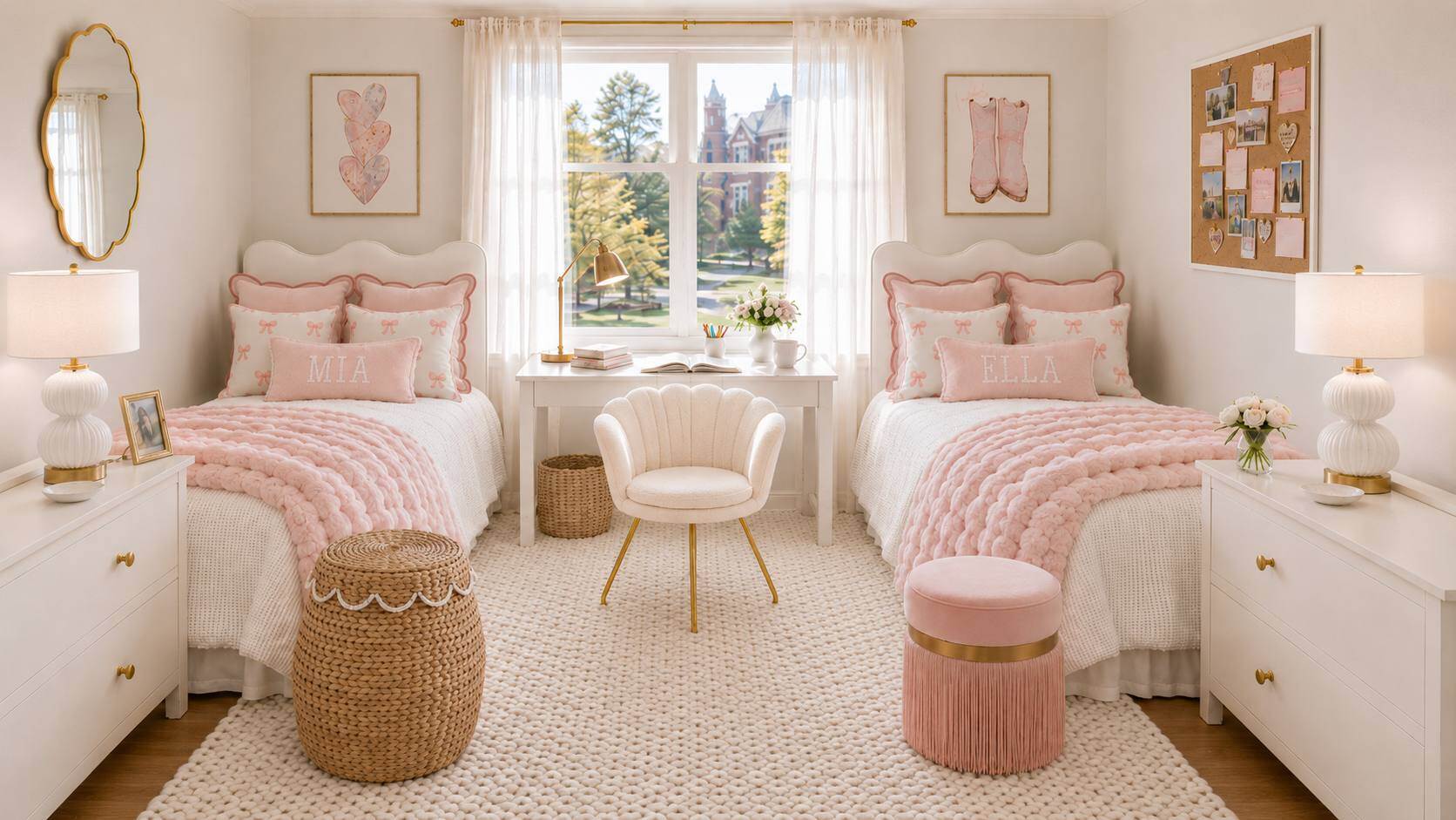
What makes it work:
- Blush pink adds warmth and personality.
- Cream and white keep the room feeling grown-up and spacious.
- Soft textures make the bed feel cozy.
- Delicate details add charm without adding clutter.
Best styling rule: Treat blush as an accent color on pillows, throws, or small decor. Never let it dominate more than 30 percent of the visible room.
Common mistake: Using bright bubblegum pink instead of soft blush. The difference between youthful and sophisticated comes down to the exact shade of pink.
Best neutral base: Cream or warm white.
Best metal finish: Gold or rose gold.
Best for: Students who want a feminine, pretty, soft, and polished dorm room that still feels practical for everyday college life.
5. Heritage Navy: classic, tailored, and timeless
Heritage Navy is the most classic palette of the five. It uses deep navy, cream, crisp white, and tailored accents to make a dorm room feel polished and grounded.
Navy works exceptionally well in dorm rooms because it adds depth without feeling messy. It is stronger than pale blue, but still timeless. When paired with cream bedding, white accents, subtle stripes, and warm textures, navy can make the room feel expensive and highly intentional.
This palette is a great choice for students who want something more mature, preppy, or traditional. It also works well for parents who want a dorm design that will not feel dated quickly.
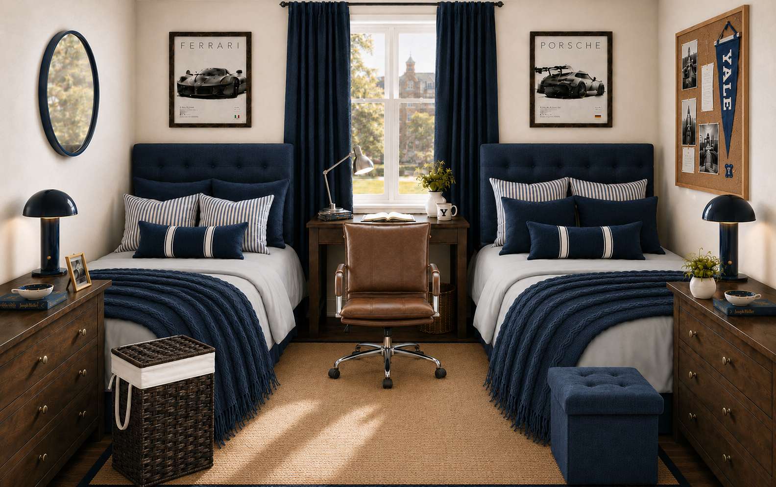
What makes it work:
- Navy gives the room structure and contrast.
- Cream and white stop the palette from feeling too dark.
- Stripes or classic patterns add a tailored feeling.
- Warm accents soften the navy and make the room feel livable.
Best styling rule: Balance navy with plenty of cream and white. In a small dorm room, navy should cover less than 40 percent of the visible textiles to keep the space feeling open.
Common mistake: Using navy without enough light contrast. A navy comforter on navy sheets in a small room feels heavy. Always pair navy with cream bedding and light accents.
Best neutral base: Cream or warm white.
Best metal finish: Brass or polished nickel.
Best for: Students who want a timeless, classic, preppy, or polished dorm room that feels a little more grown-up.
How to make any dorm color palette look more expensive
The palette itself matters, but the way it is repeated across the room matters just as much. A dorm room looks more polished when the core colors show up in more than one place.
For example, if the bed has sage green pillows, the room will feel more finished if there is also a soft green detail in the art, rug, or desk area. If the room uses navy, repeat the navy in the throw blanket, pillows, or artwork. If the room is mostly neutral, repeat texture through baskets, rugs, pillows, and throws.
The room does not need to be perfectly matched. In fact, a room usually looks better when the pieces coordinate rather than match exactly.
A simple rule to follow:
Use the main color in the bedding, repeat it once in the decor, and ground it with one neutral texture.
Dorm color palette mistakes to avoid
Choosing decor before bedding
The bedding is usually the biggest visual element in the room. Choose it first, then build the rest of the palette around it.
Buying too many accent colors
A small dorm room does not need five accent colors. Two or three main colors are usually enough to create a beautiful space.
Ignoring storage colors
Storage bins, baskets, laundry hampers, and desk organizers are highly visible. Choose pieces that blend into the palette instead of fighting with it.
Using only flat colors
A room can look unfinished if everything is made of the same smooth material. Add texture through pillows, throws, rugs, woven baskets, or curtains.
Making the room too dark
Dark colors can work beautifully, especially navy, but they need to be balanced with cream, white, or light beige so the room still feels open and airy.
What to buy first when building a dorm palette
If you are starting from scratch, buy the room in this order:
1Bedding
2Pillows and throw
3Rug
4Storage baskets or bins
5Curtains, if allowed by the college
6Art and wall decor
7Desk lighting and small accessories
This order keeps the room focused. It also helps parents avoid buying random decor pieces that do not work with the final room design.
The easiest way to choose your palette
Choose Cozy Neutrals if the student wants the room to feel calm, soft, and simple.
Choose Sage Garden if the student wants soft color but still wants the room to feel peaceful.
Choose Bluebell Cottage if the student wants something classic, pretty, airy, and fresh.
Choose Blush Bow if the student wants a feminine dorm room that still feels polished.
Choose Heritage Navy if the student wants a more tailored, timeless, preppy look.
Each palette can work in a real college dorm room because each one is built around practical pieces: bedding, pillows, rugs, storage, art, and lighting. The difference is the mood you want to create.
Related Reading
• Cozy Neutral Dorm Room Ideas — See the full room design and shop the look.
• Sage Garden — Botanical accents and calming textures.
• Best Dorm Room Rugs — How to choose a rug that anchors your palette.
• Dorm Room Shopping List for Moms — A complete checklist organized by category.